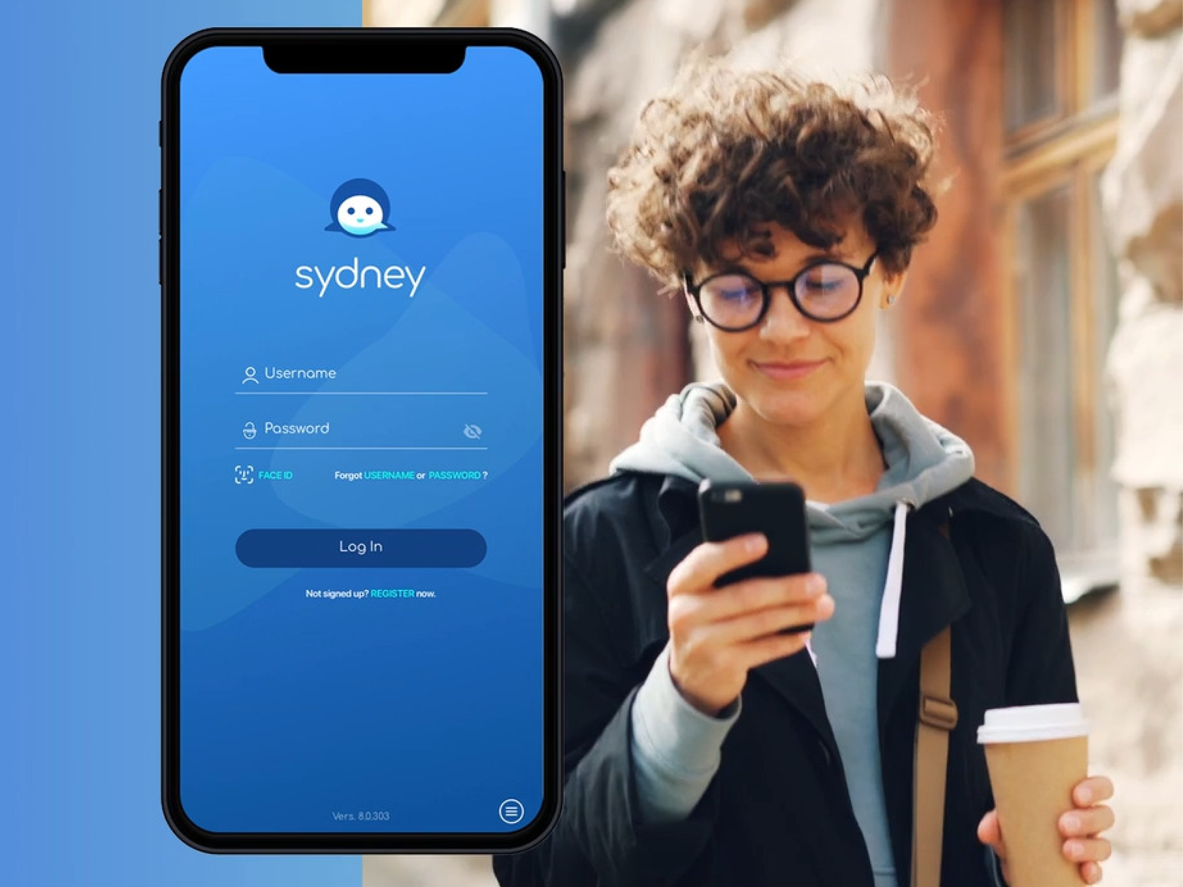
Sydney Health Live Chat
Sydney Health app for Blue Cross Blue Shield members. Designed end-to-end in-app live chat (iOS/Android) replacing 12min phone holds. Results: 50K+ interactions in first 6 months, 35% churn reduction, significant cost savings without added headcount.

Overview
The Problem
Members had one option when they needed help — call and wait. Average hold time was 12 minutes. Claims were confusing, physician access felt impossible, and members were leaving. Customer service was costing Sydney Health $2.5M a year and churn was running 35% above industry average.
Research

25 interviews across younger and elderly members, CS call log analysis, and user surveys revealed two dominant issues: long phone wait times and confusion around claims. Older users additionally highlighted usability barriers in the interface, including small font sizes, limited tap targets, and difficult navigation. The findings pointed to two distinct problems requiring a single, unified solution.
Key Design Decision 1 — Contextual Chat Entry

This was the most impactful single decision. Chat didn't open as a generic support window — it opened knowing exactly what the member was looking at. Average resolution time dropped from 12 minutes to under 2.
Key Design Decision 2 — Pre-Populated Member Data

Members were repeating themselves to every agent on every call. Pre-populating member data from their profile and backend records into the chat session cut resolution time by 25% and came up as the most appreciated dett-launch feedback.
Key Design Decision 3 — Security as a Visible Design Element

HIPAA compliance meant every interaction needed an audit trail and encryption from day one. Rather than burying security in settings, I made it visible at the moment members needed reassurance most — right before they shared sensitive health information. Trust scores went up 32% and the feature passed third-party HIPAA review without changes.
Accessibility

Elderly members struggled with the existing app across the board. After Maze testing surfaced a 45% improvement in task success with larger targets and voice input, both became standard in the accessible variant — toggleable from the chat initiation screen. Accessibility improvements measured at 40% post launch.
Full Chat Flow

Results
