H&M Checkout: Halving 60% Cart Abandonment Through User-Centered Redesign
Led 4-week redesign slashing checkout steps (6→3), abandonment (60%→30%), boosting conversions 80% (2.5%→4.5%) and NPS (42→68). Built design system scale while ensuring WCAG AA enterprise accessibility.
The Real Problem at H&M
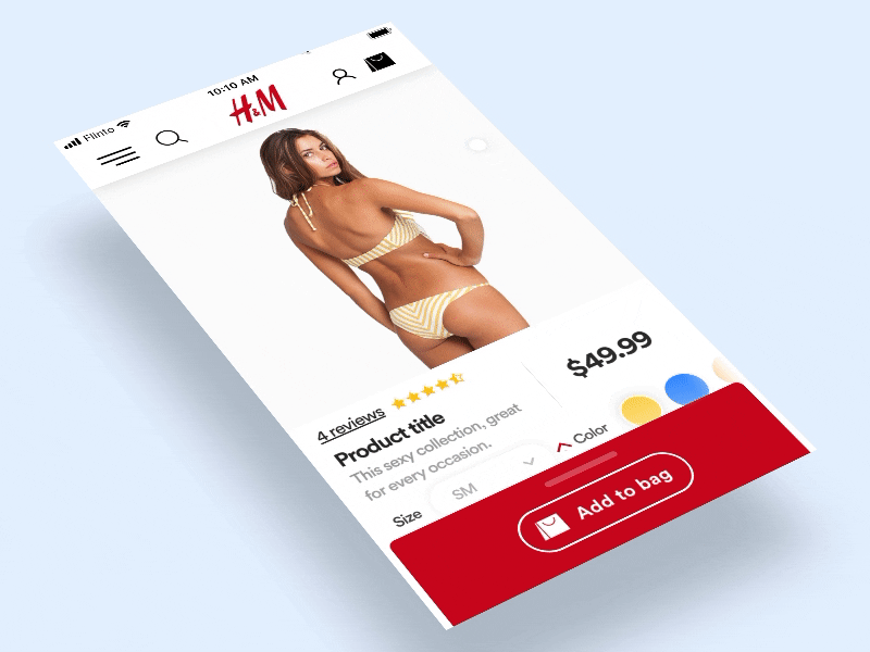
Picture this: H&M shoppers filling carts with trendy finds, only to bail at checkout—60% abandonment rate due to a frustrating 6-step slog, shaky trust signals, and mobile mishaps. As the lead designer, I saw the revenue bleed and knew we could fix it with smarter UX that felt human, not corporate.
Diving Deep: Research That Drove Change
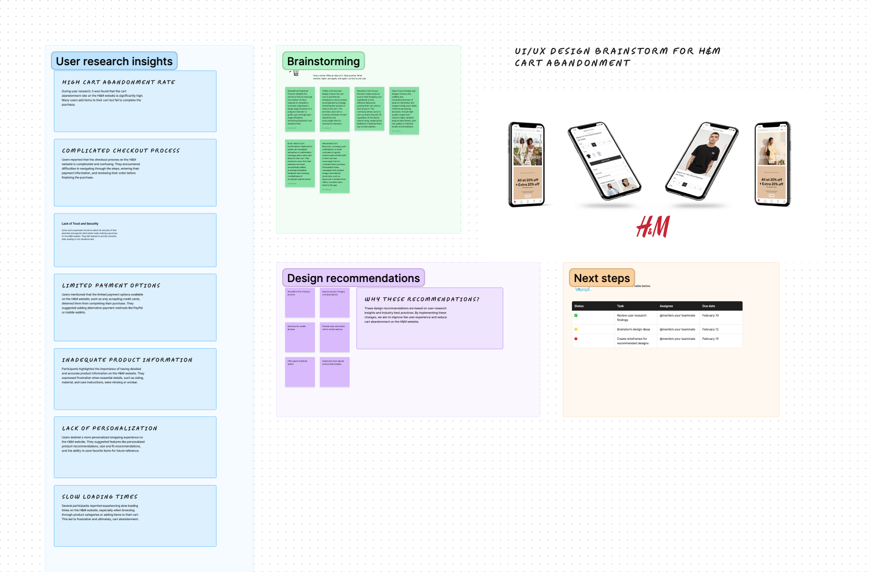
From Data to Empathy
Setting Bold, Measurable Goals
Targets We Hit Hard
Abandonment 60% → 30%
Sleek 3-step flow wins
Steps 6 → 3
Zero fluff, pure speed
Trust Rebuilt
Signals users crave
Conversions +80%
Real revenue lift
NPS 42 → 68
Loyalty skyrockets
Building for Scale: Design System Work
System That Sticks
Design Choices That Delivered
Mobile-first thumb zones guided every tap. Subtle animations gave feedback without distraction. Progress bars + security badges built instant trust. WCAG AA accessibility wasn't checked—it was baked in from wireframes. The result? A checkout that felt welcoming, not walled-off.
The Proof: Metrics Speak Louder
What I learned: Listen to data + users, prioritize ruthlessly, collaborate cross-team. Design isn't art—it's the lever that turns frustration into loyalty and revenue.