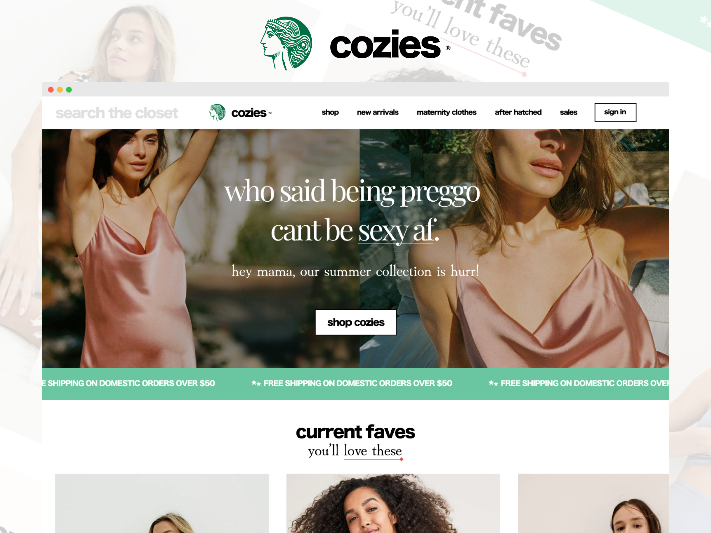
Designing Cozies — Maternity Fashion That Actually Gets You
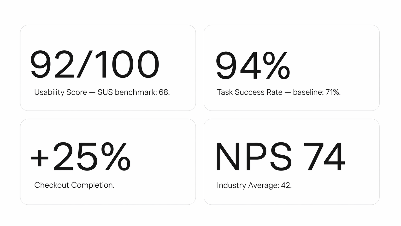
Led end-to-end UX/UI design for iOS and Android app and web experience — from research through to final handoff — in 6 weeks. The result was a 92/100 usability score, 94% task success rate, and a 25% increase in checkout completion.
Overview
Cozies is an emerging maternity fashion brand. I led end-to-end UX/UI design for their iOS and Android app and web experience — from research through to final handoff — in 6 weeks. The result was a 92/100 usability score, 94% task success rate, and a 25% increase in checkout completion.
The Problem
Most maternity shopping experiences are just regular e-commerce with a "maternity" filter bolted on. They don't account for how fast a body changes during pregnancy, or how much anxiety surrounds getting it wrong. Three things were killing conversion before a single item hit the cart — women couldn't tell what was right for their stage of pregnancy, checkout had too many steps, and nobody had heard of Cozies yet so trust was low.
Research
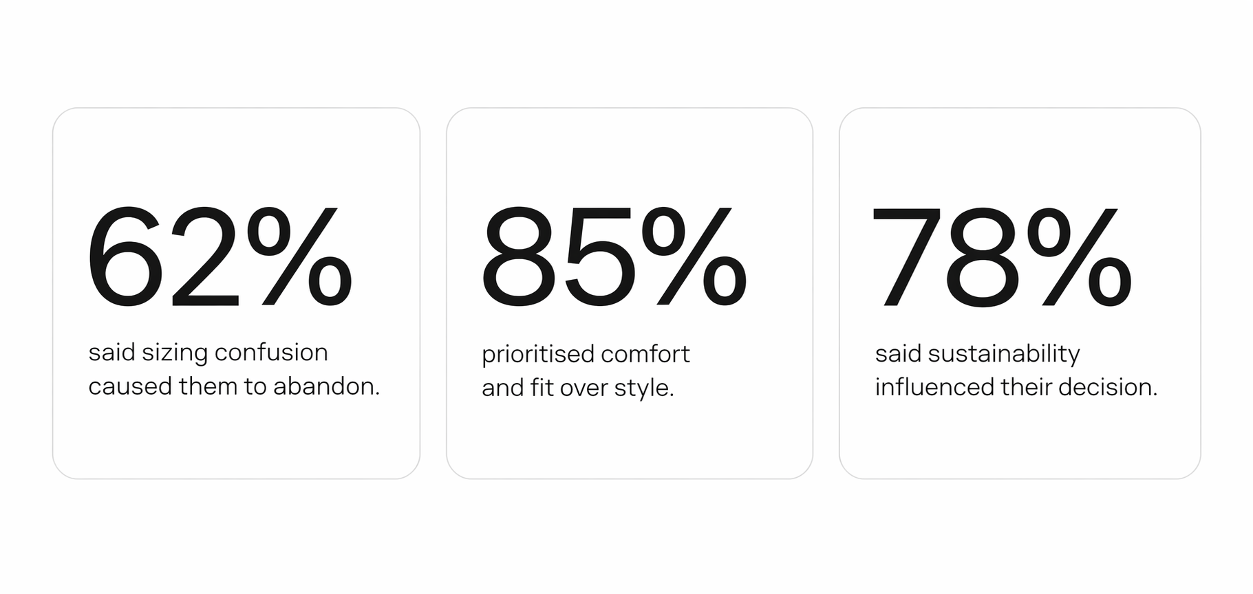
I spoke with 11 women — 3 currently pregnant, 8 postpartum — across different backgrounds and trimesters. A follow-up survey validated the patterns. The biggest finding wasn't sizing complexity, it was disorientation. Women didn't know where to start. A catalogue full of products with no indication relevant to them right now made browsing feel like work. Card sorting with 25 users confirmed it. When given the choice, women organised products by trimester — not by occasion, not by category. That became the foundation of the entire IA.
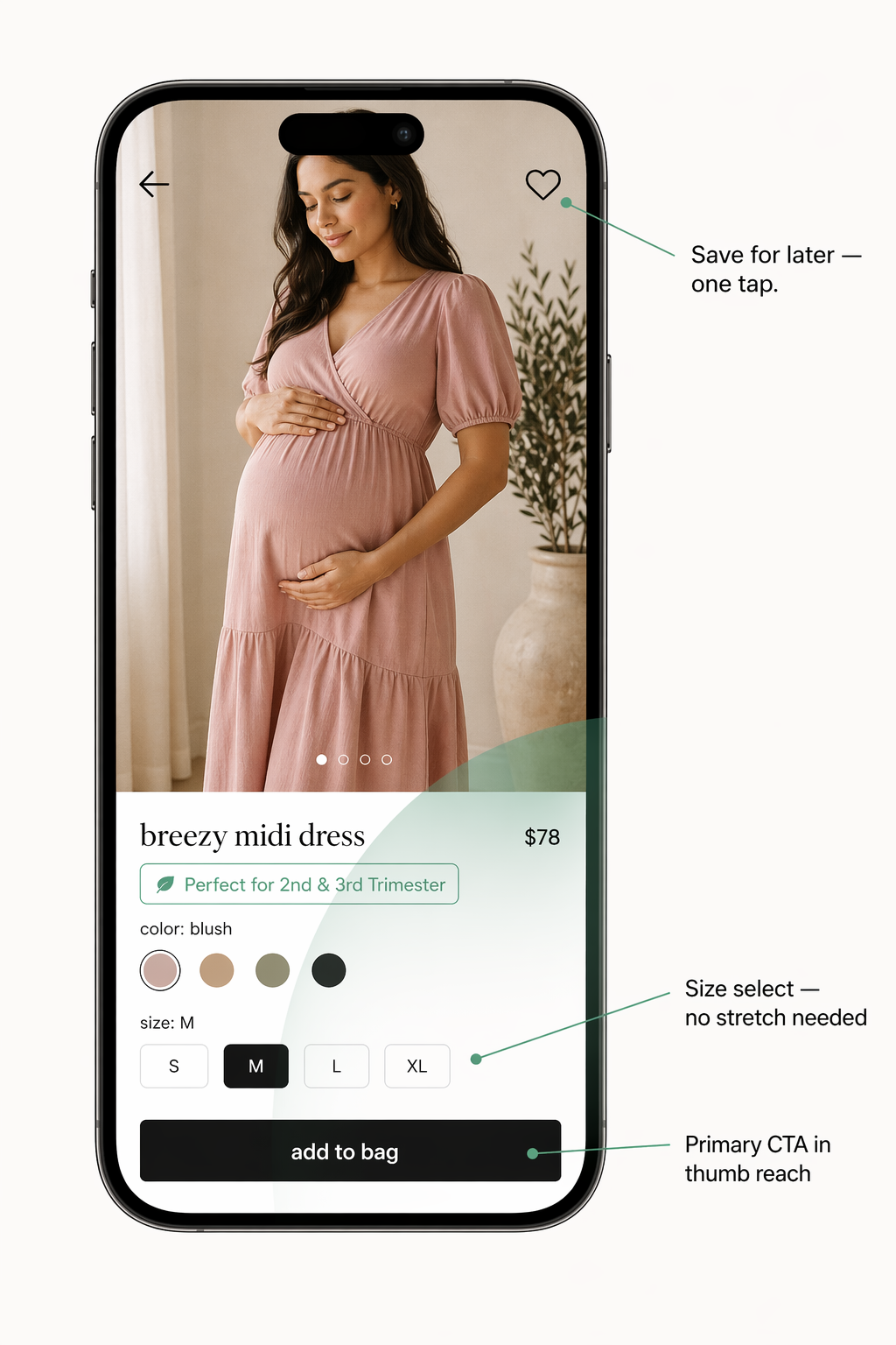
Key Design Decision — Trimester Filtering
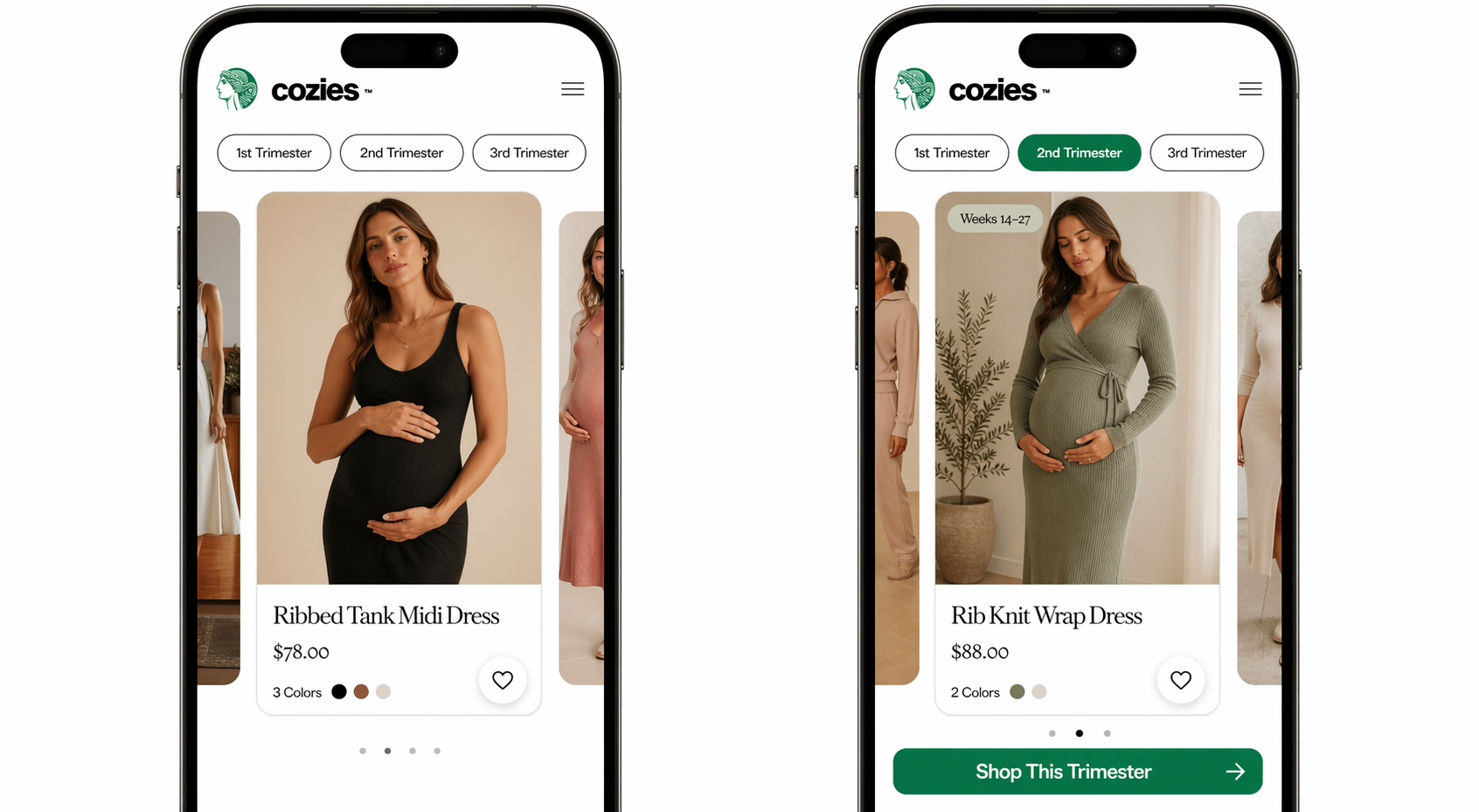
This was the central design decision. Instead of asking women to decode a size chart or guess what would fit, the app meets them where they are. You tap your trimester, the catalogue becomes relevant to you instantly. Product cards show a simple label — "Great for Weeks 14–27" — so there's no ambiguity. The filter persists across the session. If you leave a product and come back to browse, your trimester is still selected. No repeated friction.
Checkout Flow
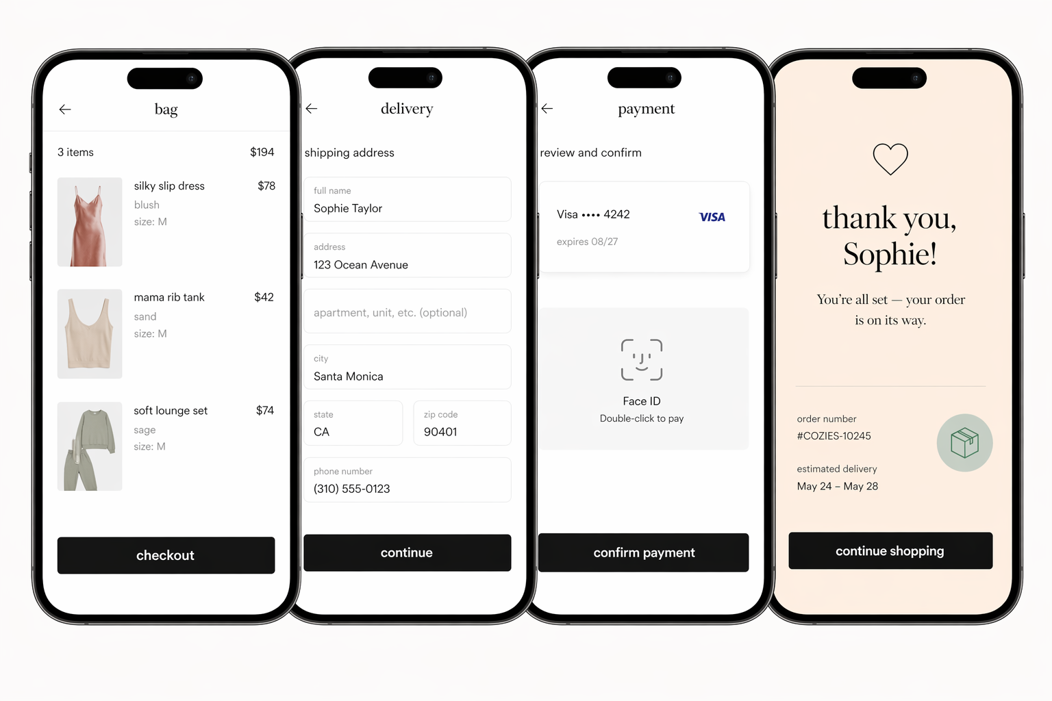
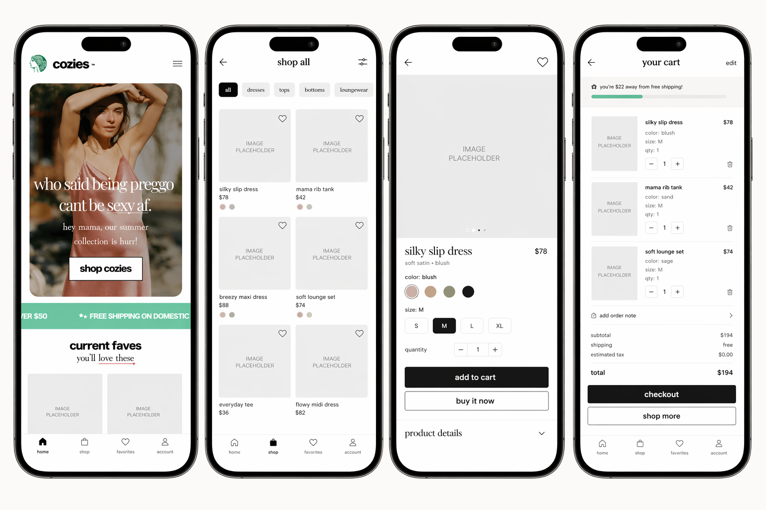
Checkout went from 9 steps to 4. Every screen has one job. No account creation forced, no upsell interruptions, biometric payment removes the biggest mobile drop-off point — getting your card out.
One-Handed Navigation
Web Experience
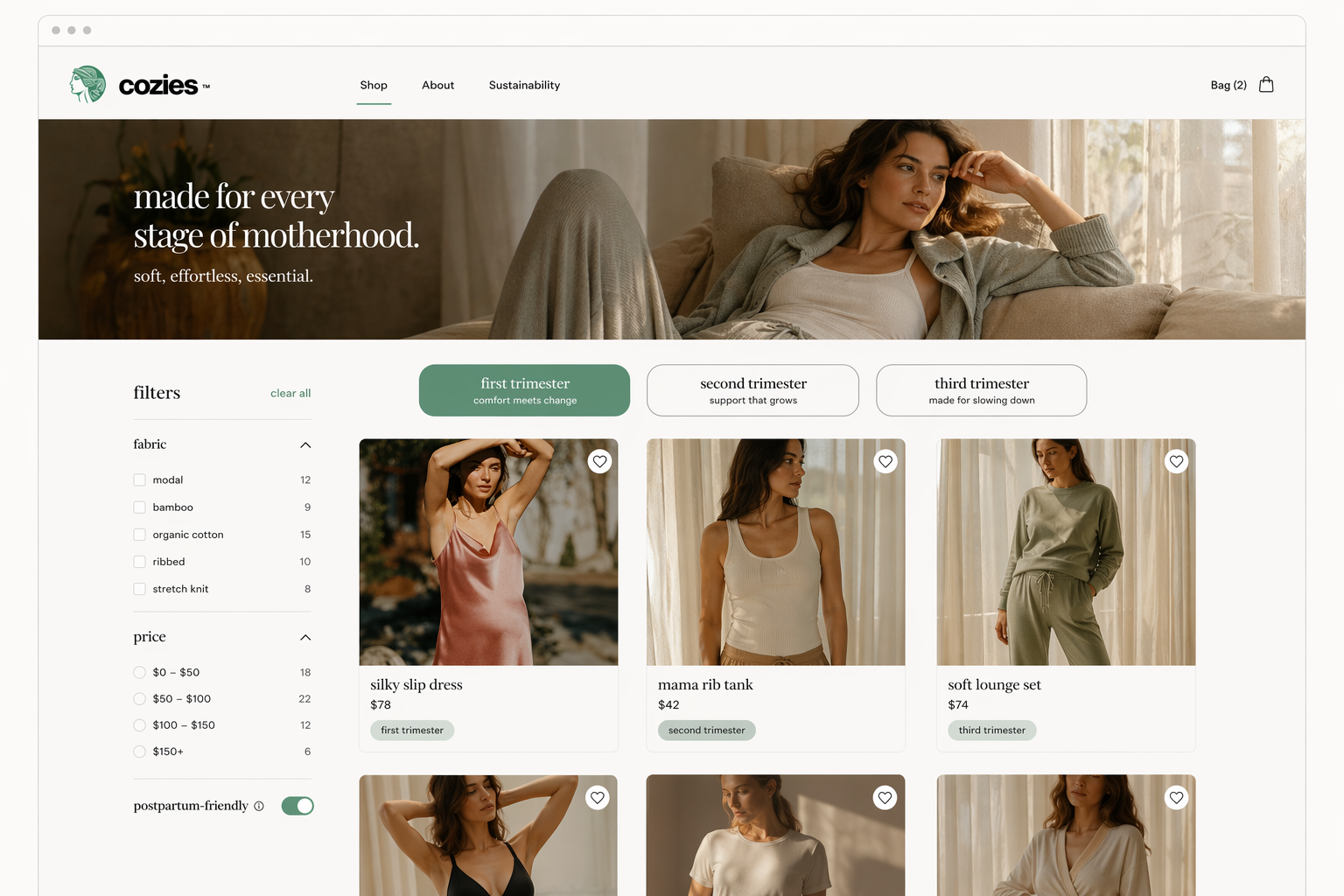
The web experience uses the same design system as the app — same components, same trimester logic, same product cards. The layout adapts to the wider canvas but nothing about the experience changes. A woman who shops on her phone and then switches to desktop doesn't have to relearn anything.
Trust
For an unknown brand, doubt kills the sale. Three things were added throughout the experience — not as decoration, but placed at the exact moments doubt would appear. On the product page: a material transparency section below the fold showing fabric composition, wash instructions, and a "Why we chose this fabric" one-liner. At checkout: a simple progress bar — three dots showing where you are in the flow. Small but effective. Women knew they were nearly done. On the confirmation screen: a clear returns policy summary in plain English. One line. No jargon.
Results
What I Learned
“"Alex's work transformed our MVP into a category-defining experience. The sizing innovation alone drove our highest conversion month ever."”