H&M is a global fashion retailer known for offering trendy clothing and accessories at affordable prices.
TIMELINE
4 Weeks
ROLES
Interaction Designer
UI/UX
searchResearch
For H&M, I streamlined the checkout process from the number of steps, addressing user frustrations and reducing cart abandonment, which led to increased conversion rates. In both cases, through research, iteration, and a focus on measurable outcomes, I created designs that delighted users and drove business value.
As part of the UX team, I worked closely with the Design System lead to creating elements like colors, spacing, typography, elevation, and shadow. We worked on the components: buttons variant and states, data display visuals, visual feedback, navigation, etc. I also created system and outline icons and mid and high-level illustrations using our brand colors.
Observation
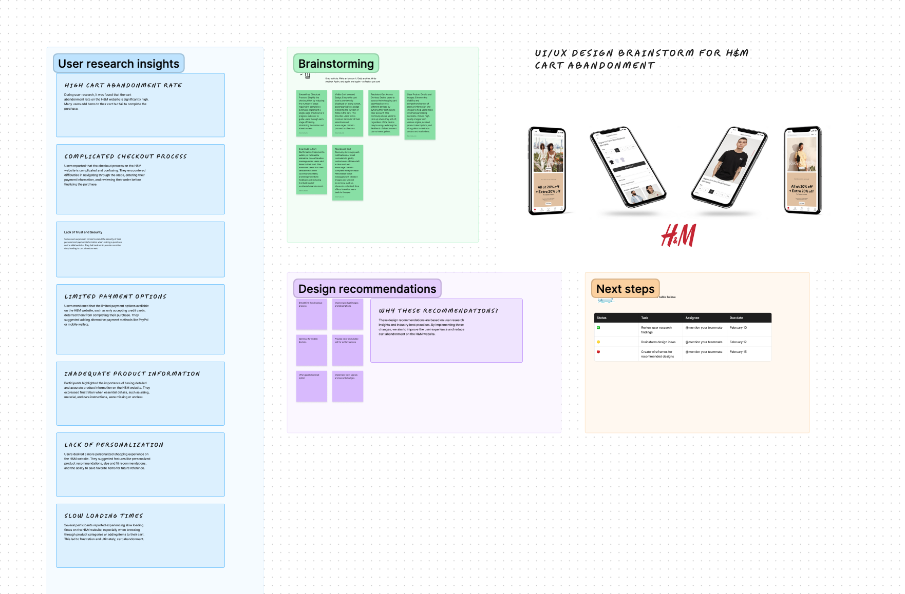
Through rigorous user testing and analytics analysis, it was observed that prior to the redesign, H&M's online store experienced a high cart abandonment rate, approximately 60%. Additionally, the checkout process consisted of an average of 6 steps, leading to potential user frustration and increased abandonment rates.
Interviews
To gain deeper insights into user behavior and preferences, I conducted interviews with a diverse group of H&M customers. It became evident that concerns about the checkout process resonated strongly. Users expressed frustration with the lengthy checkout steps and cited security and trust issues as significant barriers to completing purchases.
Findings
Based on the observations, interviews, and survey results, several key findings emerged. The cart abandonment rate of 60% underscored the urgency to address usability issues within the checkout process. Users expressed frustration with the 6-step checkout flow and cited concerns about security and trust. These findings reinforced the need for a comprehensive redesign to improve user experience and increase conversion rates.
Survey
The survey data provided quantitative validation of the observations and interview findings. It revealed a cart abandonment rate of 60% and highlighted the desire among users for a simpler, more streamlined checkout experience. Additionally, the survey responses indicated a clear preference for a reduced number of checkout steps and emphasized the importance of trust and security features.

Reduce Cart Abandonment
Aim to decrease the cart abandonment rate from 60% to 30% through a more intuitive and streamlined checkout process.
Simplify Checkout Steps
Decrease the average number of checkout steps from 6 to 3 to minimize user effort and friction.
Enhance Trust and Security
Implement trust signals and security features to alleviate user concerns and improve confidence in the checkout process.
Improve Conversion Rate
Target an increase in the conversion rate from 2.5% to 4.5% by optimizing the checkout flow for higher completion rates.
Enhance User Satisfaction
Aim to increase the average CSAT score for the checkout process from 3.5 to 4.2 by addressing user pain points and improving overall usability.
format_paintDesign & Components
The UI design approach for addressing the challenges of cart abandonment and streamlining the checkout process for H&M's online store focused on creating a visually engaging, user-friendly interface that enhances usability and instills trust in the users. Key principles guiding the UI design included consistency with H&M's brand identity, clarity in communication, and simplicity in interaction.
PROJECT GOALS
Crafting a Solution for Enterprise and Accessibility
- Enterprise-Ready
- Meticulously designed to meet the stringent requirements and standards set by the enterprise client, ensuring seamless integration with their existing systems and processes.
- Accessibility First
- A paramount objective was to ensure the product met the accessibility standards set by the company, making it usable by individuals with diverse abilities. Rigorous testing and iterations were conducted to achieve this crucial goal.

H&M
The design prioritized clear visual hierarchy, intuitive navigation, and strategic placement of calls-to-action to guide users seamlessly through the checkout flow. Visual cues were employed to highlight important information, such as product details and shipping options, while maintaining a clean and uncluttered interface.
Furthermore, attention was given to optimizing the UI for various devices and screen sizes, ensuring a responsive and cohesive experience across desktop, mobile, and tablet platforms. By incorporating these principles into the UI design, the aim was to create a visually appealing and intuitive interface that enhances the overall user experience and encourages users to complete their purchases with confidence.
Prototype & Animations
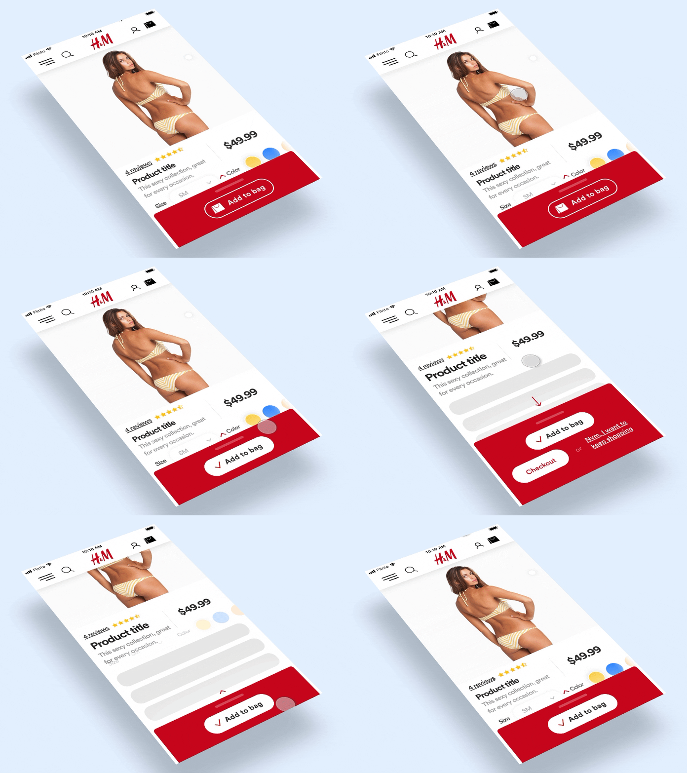
Created rich animations for visual treatments
trending_upEvaluation
How we got here
The evaluation phase reflects on the journey taken thus far in the project. It involves assessing the progress made, challenges encountered, and the overall effectiveness of the design decisions and implementations.
-
Evaluations
- The evaluations of H&M's online store encompassed various methodologies, including observations, interviews, surveys, and analytical data. These evaluations aimed to identify existing pain points within the checkout process and formulate strategies for improvement.
-
Findings
- Synthesizing insights from observations, interviews, and survey data, several key findings emerged. The 60% cart abandonment rate underscored the imperative to address usability issues within the checkout flow. Users' frustrations with the 6-step process and concerns regarding security and trust emphasized the necessity for a comprehensive redesign aimed at enhancing user experience and bolstering conversion rates.
Future Considerations
Moving forward, it's essential to implement design strategies aligned with the identified findings to achieve desired outcomes. Priorities include:
-
Streamlining Checkout Flow: Continuously optimize the checkout process to reduce steps and minimize user effort, aiming for a seamless and intuitive experience.
-
Enhancing Trust and Security: Implement robust trust signals and security features to instill confidence in users and mitigate concerns regarding data privacy and transaction security.
-
Improving Conversion Rate: Focus on refining the checkout flow to improve completion rates, thereby increasing overall conversion rates and driving revenue growth.
-
Enhancing User Satisfaction: Prioritize user feedback and iterate on design solutions to address pain points effectively, aiming for higher satisfaction scores and improved user loyalty.
