Foodwell
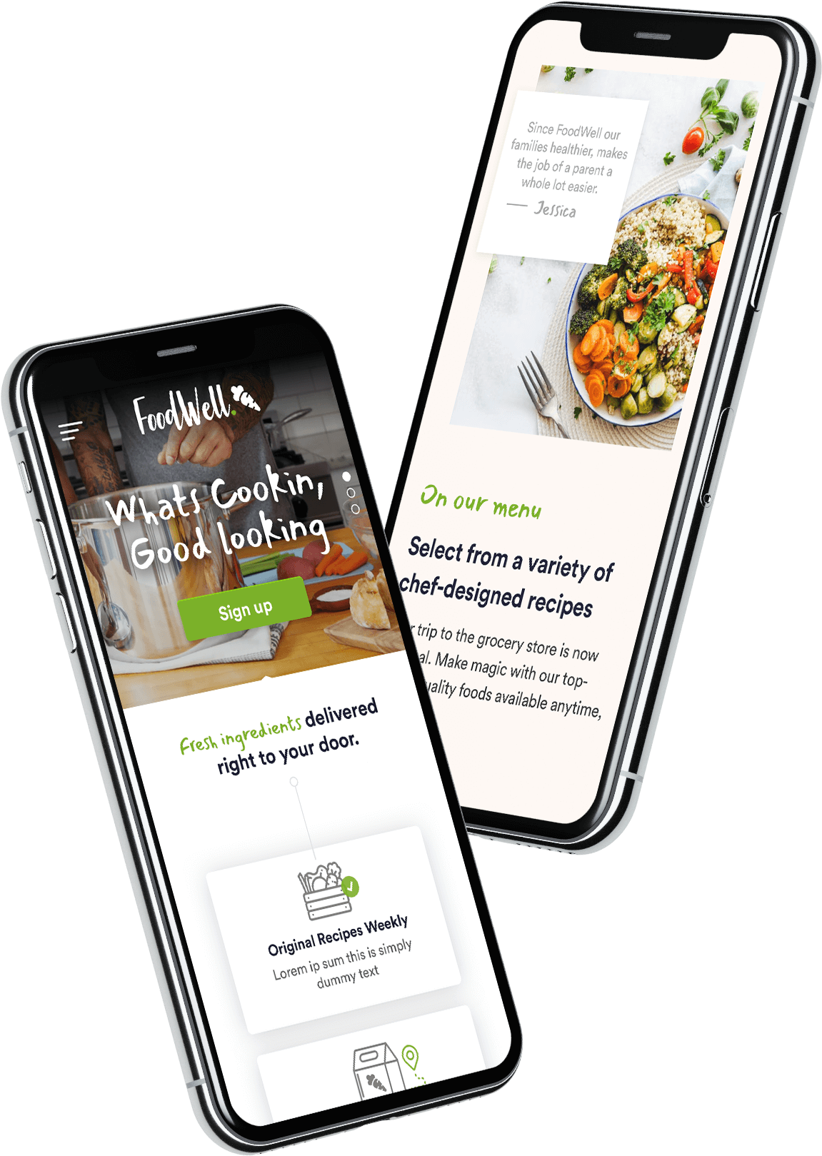
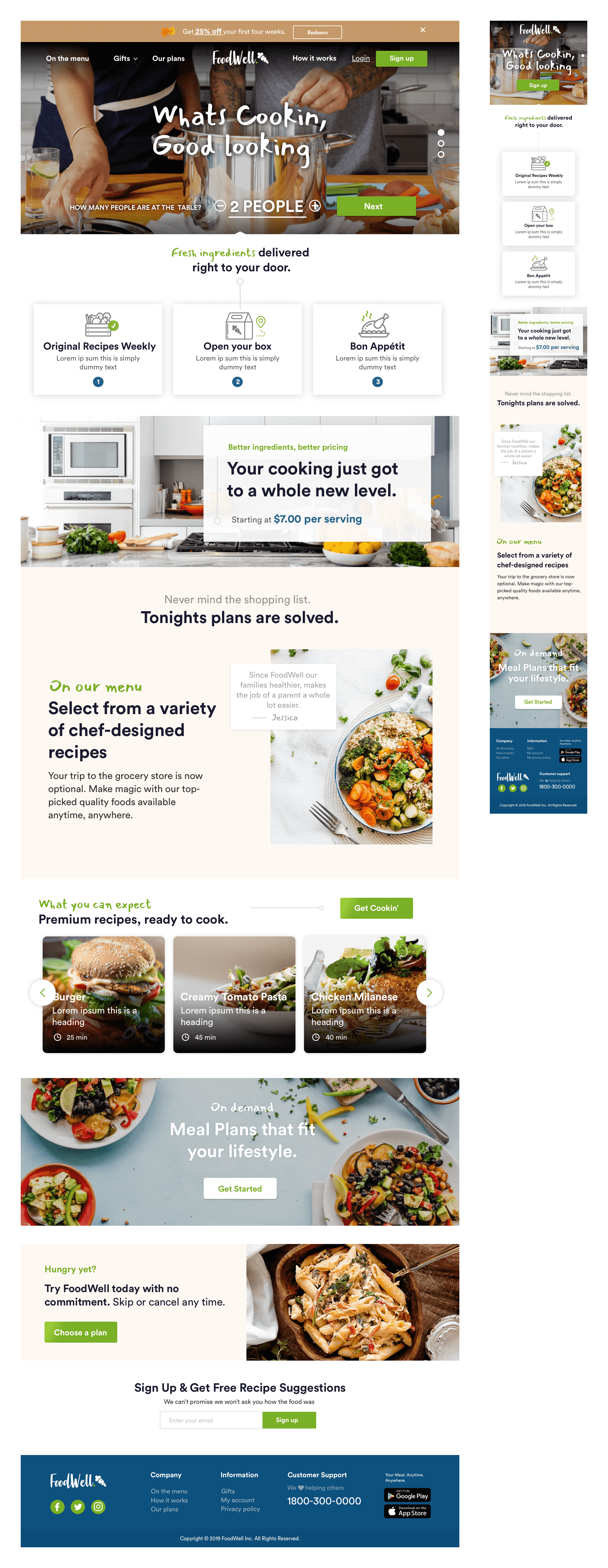
FoodWell is a subscription-based healthy food delivery service that offers customers monthly meal plans, complete with fresh ingredients and easy-to-follow recipe cards. The goal of the project was to create a digital experience that supported the service and provided a seamless and intuitive user experience.
ROLES
Interaction Designer
UI Design
Research
Observations
FoodWell customers are struggling with the current ordering workflow, encountering a lack of smart recommendations for food discovery and a checkout process devoid of urgency.
Interviews
In interviews, customers emphasized the importance of convenience, affordability, and variety in meal plans. They expressed a strong preference for an intuitive and user-friendly digital experience.
Findings
Through user research, it's evident that customers are seeking a more streamlined ordering process that offers personalized meal recommendations. The urgency in the checkout process is crucial for prompt decision-making.
Survey
Survey responses reaffirmed the need for a simplified ordering process and indicated a high interest in personalized meal suggestions.

Design Criteria
Design
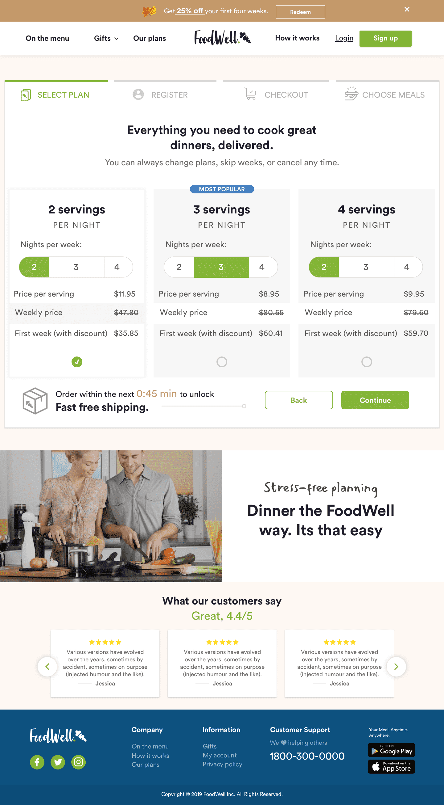
For FoodWell's digital experience, our primary focus was on creating a streamlined and intuitive ordering process. We conducted thorough user testing to understand pain points in the existing workflow and redesigned it to minimize steps and maximize user efficiency. By optimizing the user interface and strategically placing call-to-action buttons, we ensured that users could navigate from selecting their desired meal plans to completing their orders seamlessly.


Simplified Ordering Workflow: The user interface will be optimized for easy navigation, condensing order placement steps to enhance the overall user experience.
Smart Recommendations: Design an intuitive meal discovery interface and implement personalized meal suggestions based on user history and preferences.
Prototype
N/A
Evaluation
Evaluations
User testing conducted at various stages of development provided valuable insights into user behavior and preferences. Metrics were tracked for order completion rates, user engagement, and satisfaction.
Findings
Significant improvements in user experience were observed, leading to increased conversions and enhanced customer retention. The streamlined ordering workflow and smart recommendations contributed to these positive outcomes.
Future Considerations
- Continuous Improvement: Regularly gather user feedback to refine the digital experience and implement updates based on evolving user preferences.
- Accessibility and Inclusivity: Ensure the platform is accessible to users with diverse needs, considering language options and user assistance features for inclusivity.
- Expansion Opportunities: Explore partnerships with nutritionists or chefs to enhance meal recommendations and consider expanding the service to cater to specific dietary requirements or preferences. .
